TEAM LOG
Poster EDITING process FRIDAY 19th - FRIDAY 25TH November
|
|
|

|
|
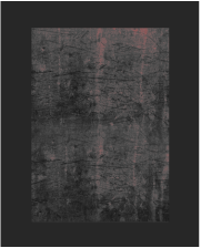
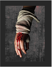
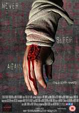
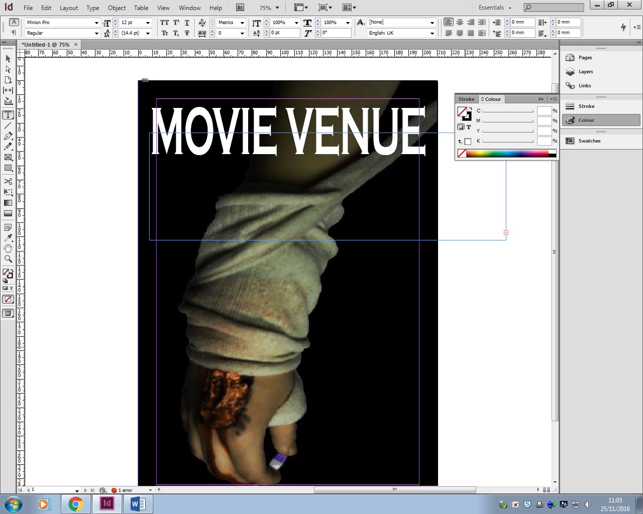
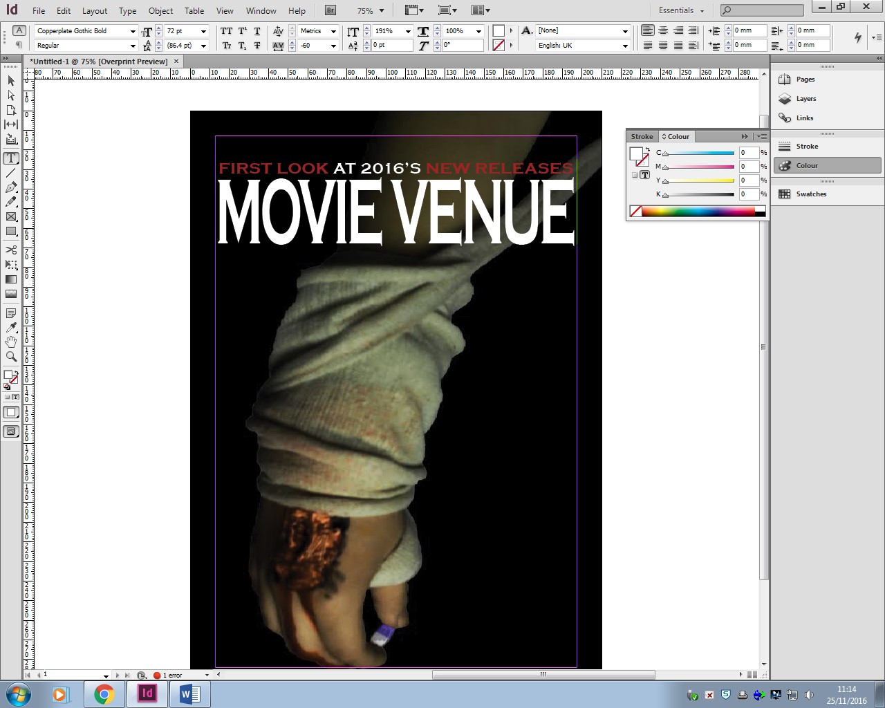
Simon - During the process, i was in charge of taking the photos in the green room as well as creating the wound on the model's hand for the poster and magazine. I also created the background in photoshop by merging two texture images from google together to an A1 size (84.1 x 59.4cm). I applied a filter to give the red effect to the background and also experimented with filters to give the hand a dirty look as well as give the blood a glow effect. At this point, i handed my work over to Amy to add the poster design element.
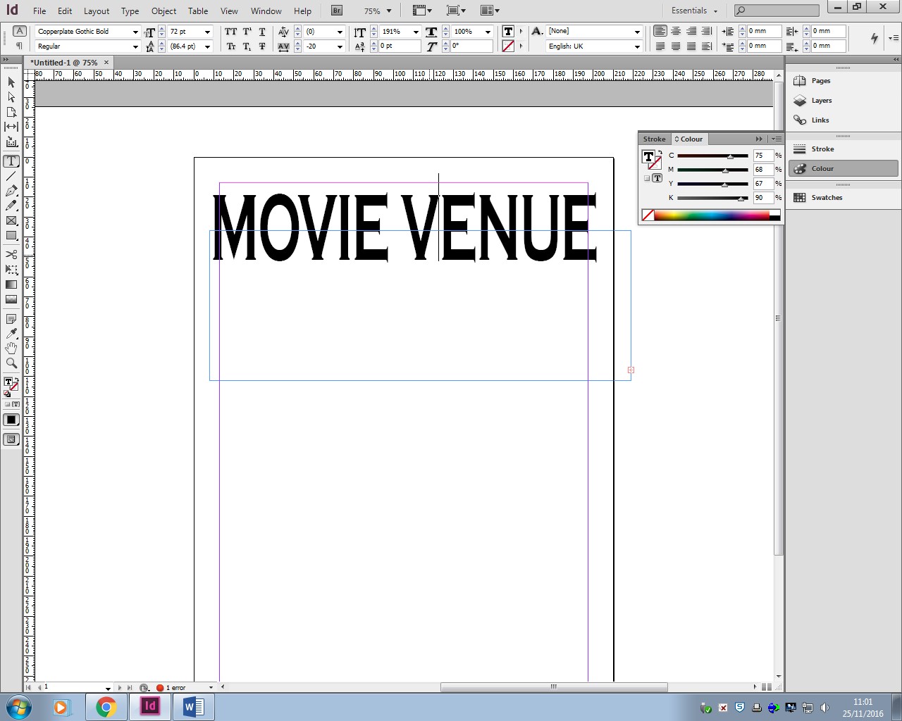
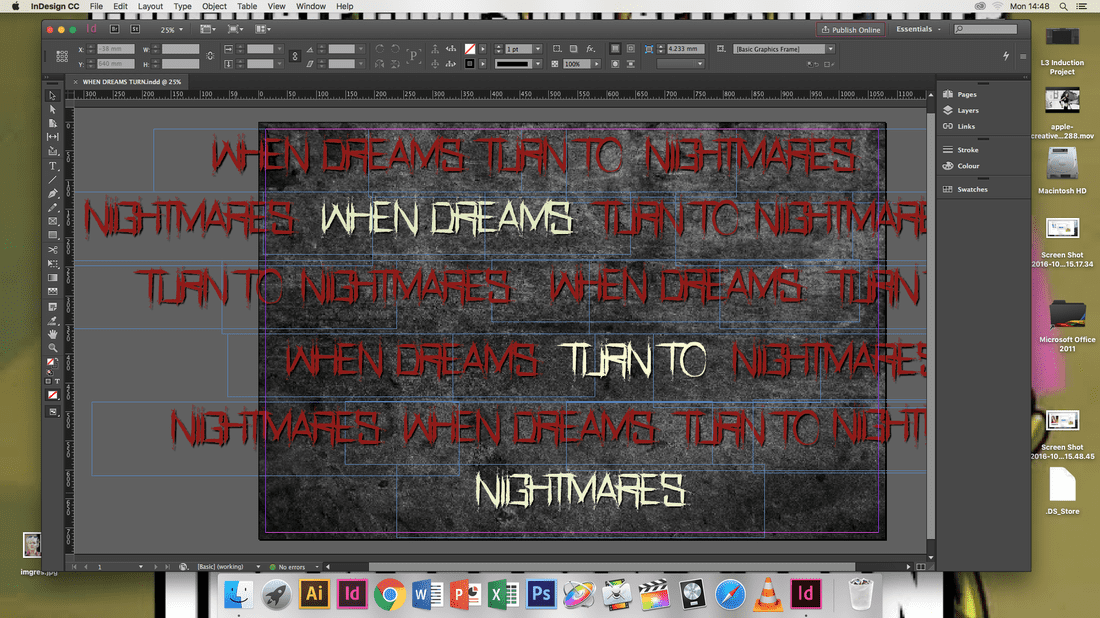
Amy - My role in this process was to make the layout for the movie poster. This required my to create the text font and place everything so that it looks visually pleasing but still follows the typical structure of a poster. For this I used Photoshop and InDesign to use editing tools to help me achieve this.
Amy - My role in this process was to make the layout for the movie poster. This required my to create the text font and place everything so that it looks visually pleasing but still follows the typical structure of a poster. For this I used Photoshop and InDesign to use editing tools to help me achieve this.
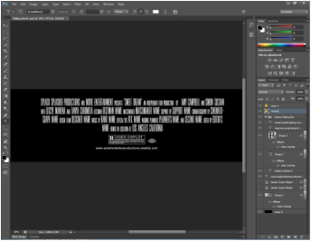
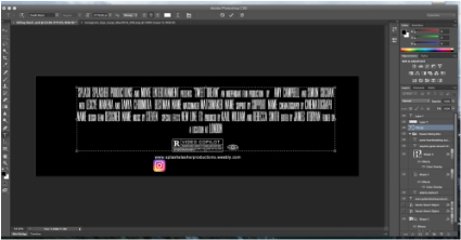
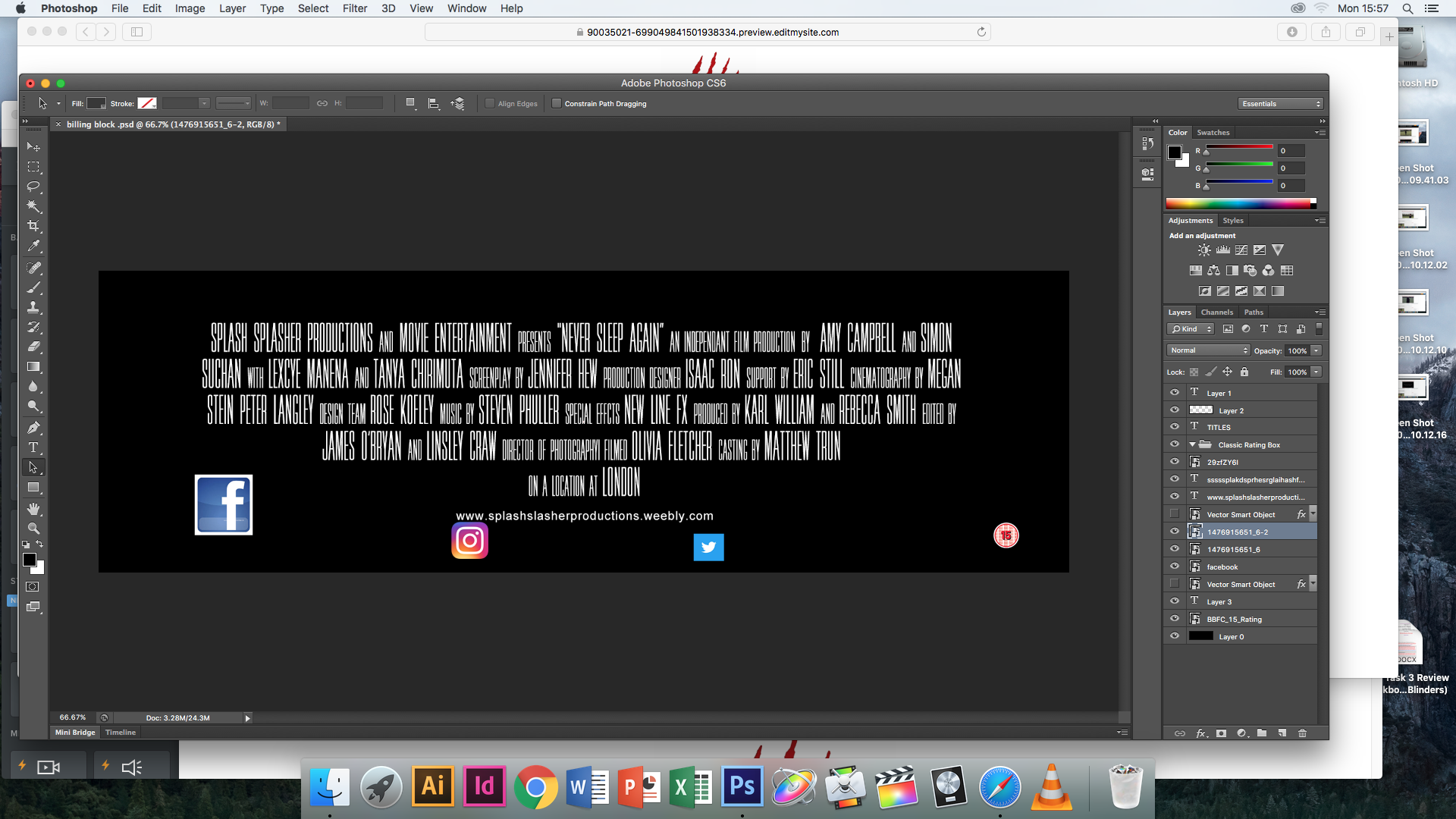
billing block - lexcye
|
|
|
When making this billing block, I used another poster from another horror film as an example on where to place the icons and images and what extra writing to include on it. I began with using a template that I downloaded of the internet which already included the font of the writing with it. After I changed the names of the actors and the name of the companies, I deleted the icons that did not suit the the trailer, for example the American ones. I then replaced them with the ones we decided to use for our poster.
Magazine editing process week friday 18th - 25th friday
|
|
|
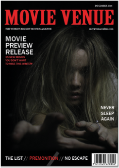
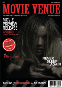
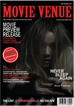
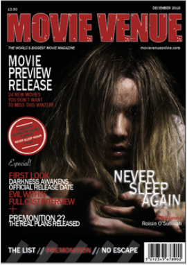
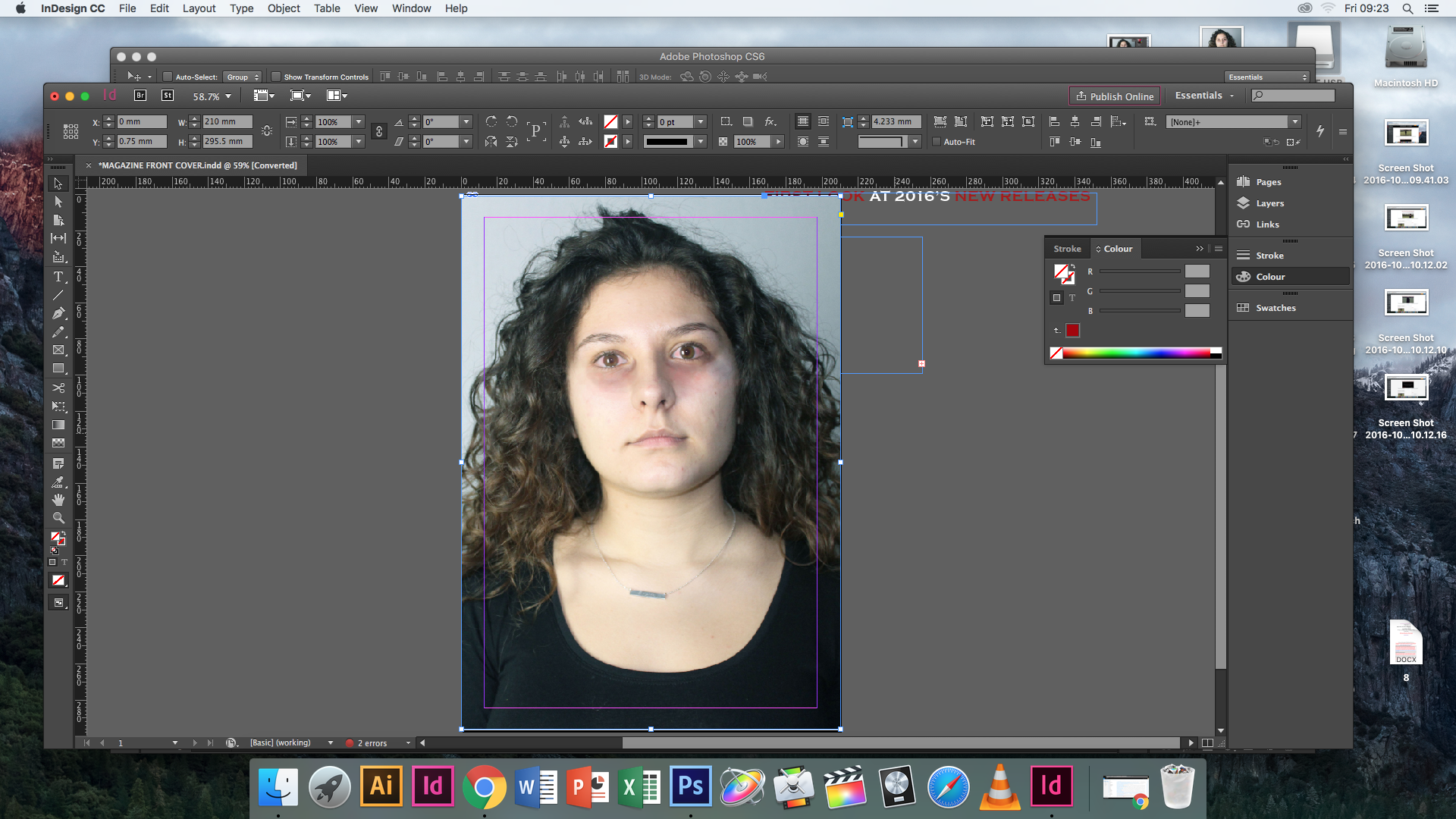
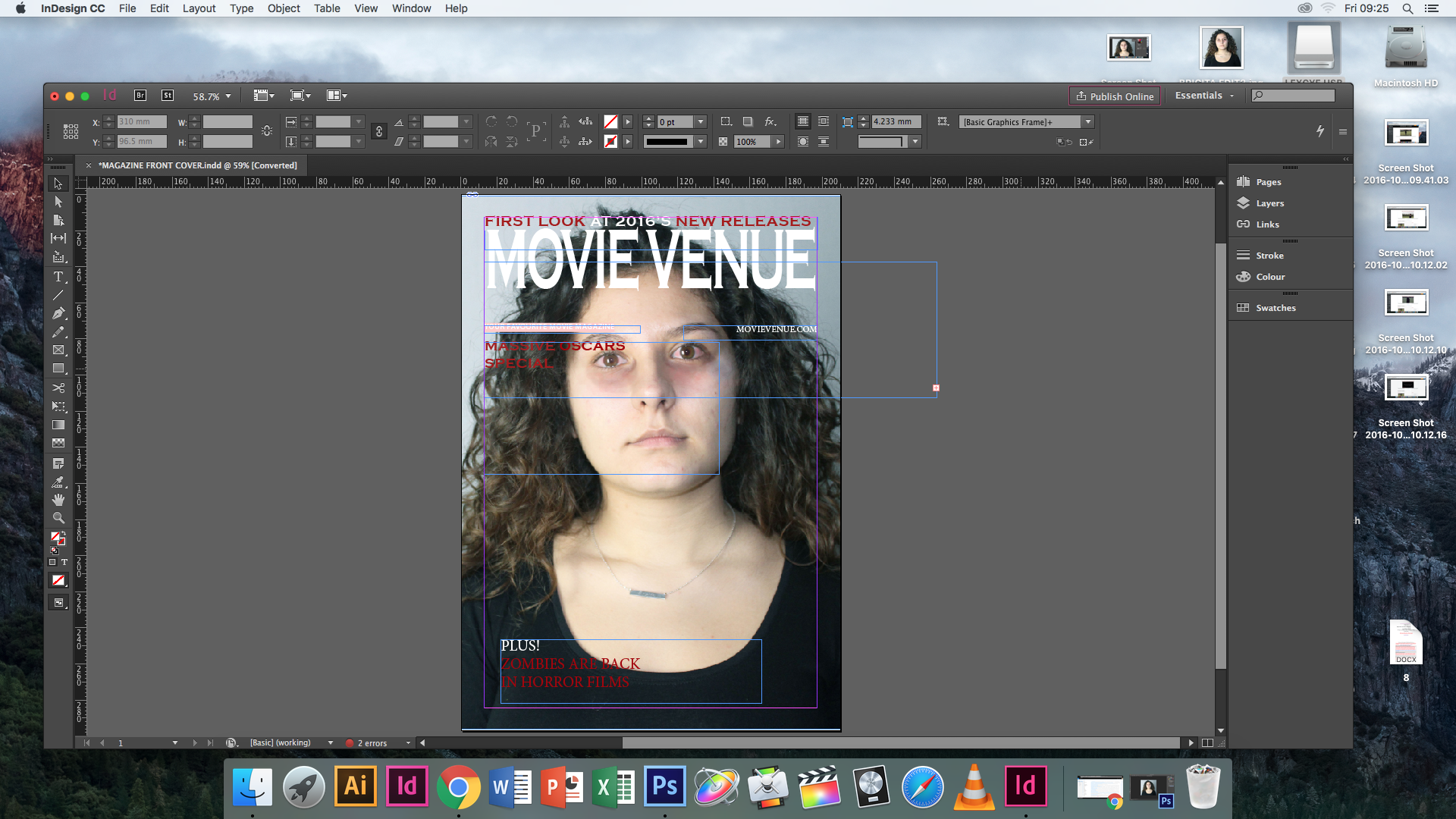
Lexcye - For the magazine front cover I followed the step by step guide video on creating a magazine front cover in InDesign. I began by creating a name for the magazine then continued by selecting a font and deciding the positioning of the masthead.
I then inserted the edited photo and resized it to fit as the main image. I continued by creating and adding in the selling and cover lines for the magazine front cover to start coming together.
I then inserted the edited photo and resized it to fit as the main image. I continued by creating and adding in the selling and cover lines for the magazine front cover to start coming together.
friday 9th december re-edit of magazine
|
|
|
POSTER PHOTOSHOOT - FRIDAY 11TH NOVEMBER
|
|
|
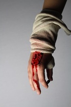
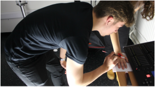
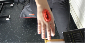
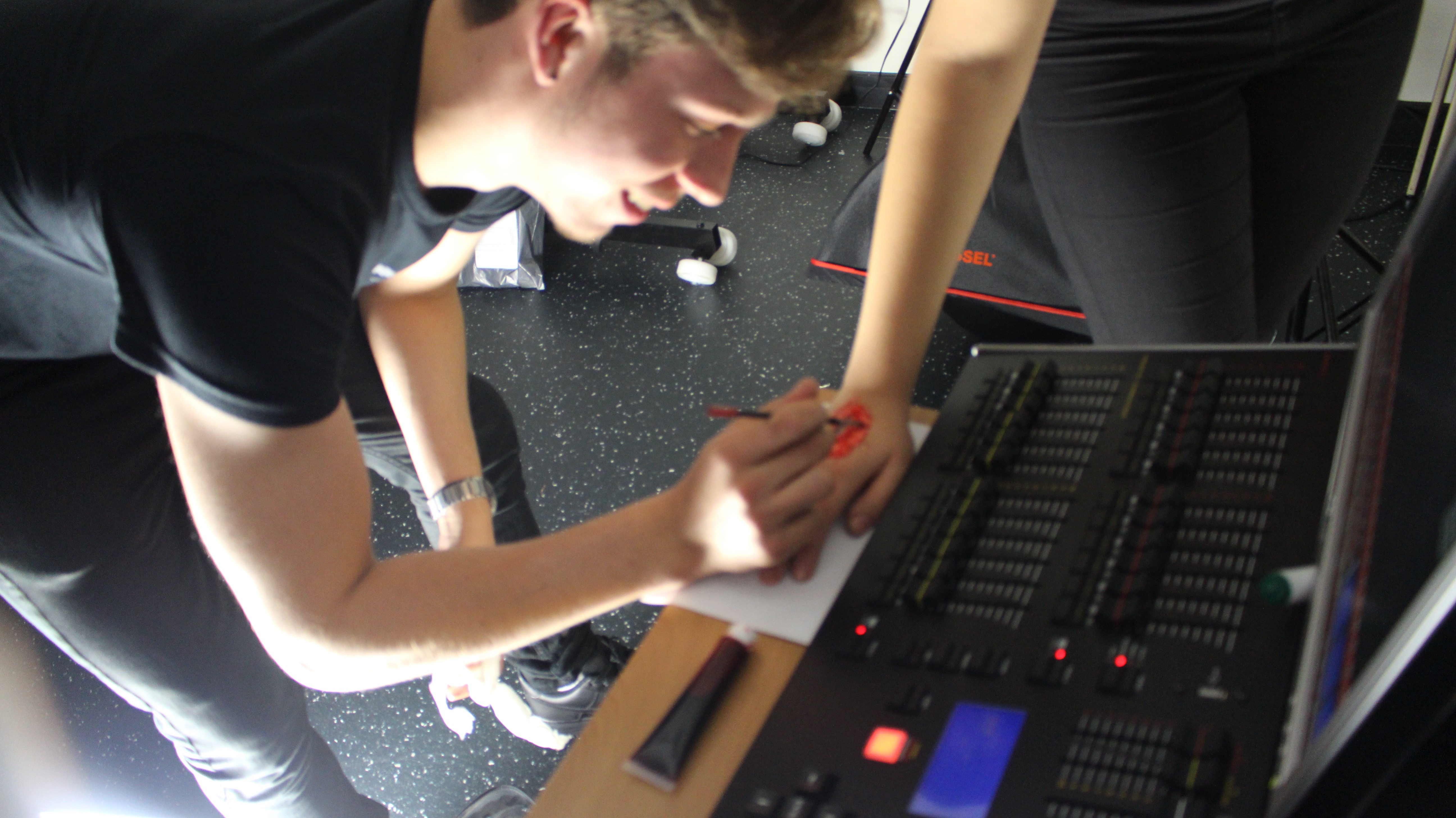
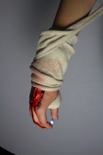
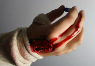
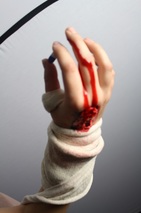
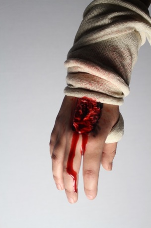
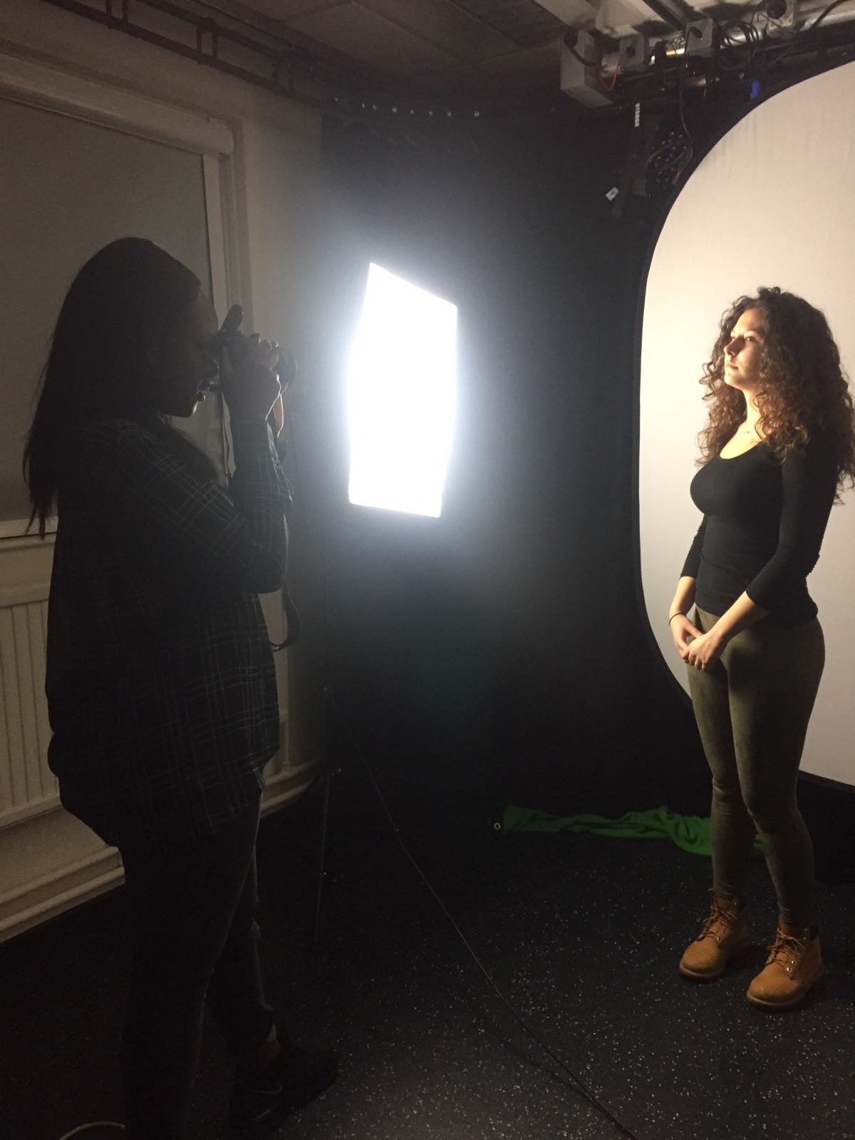
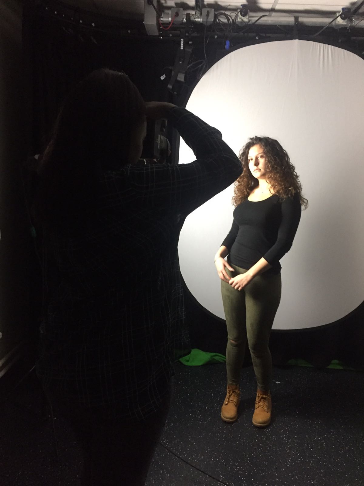
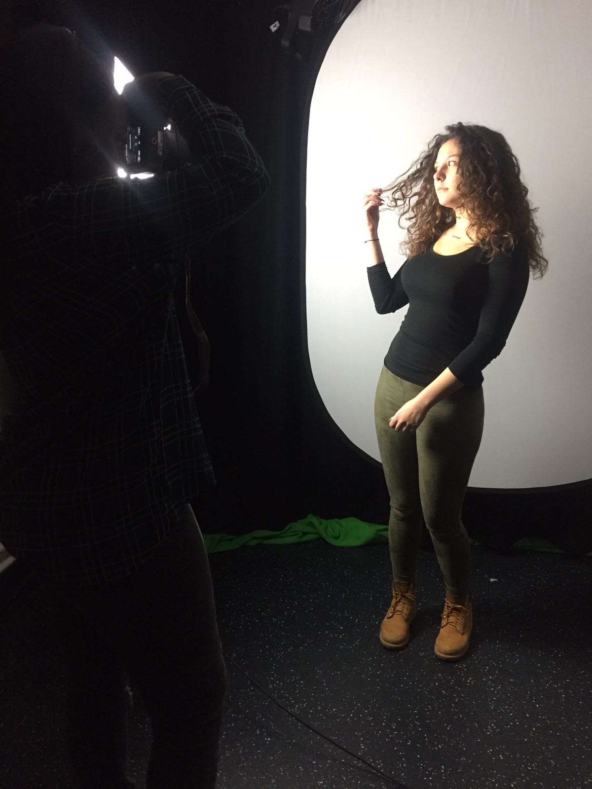
Simon - During the photoshoot, i created the wound on the actor's hand. I did this by using liquid latex, tissue layers, black liquid paint and also blood pill to give the spilling blood effect. We also used a bandage and used Special FX blood clothing spray to make it look more realistic. I was in charge of taking the pictures of the hand, positioned in front of a white background. We experimented with a variety of lighting positions. Here is a few photos we took:

|
|
|
magazine photoshoot Taken by Tanya - monday 28th november 2016
|
|
|
Final Edit for magazine by Tanya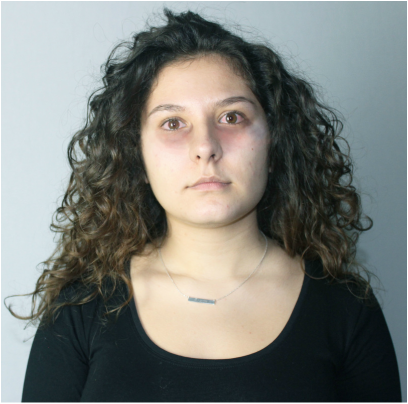
Here I edited the pictures, which we wanted to make her look tried and restless, as people who have cancer and always look tried and not done have a lot of energy because of the treatment they receive. I focused on the eyes and the area around the eyes. i used the brush tool to make her under eye dark and always put white around the face to make her look pale. I decreased the brightness and increased the contrast.Also, added red inside her eye to create blood shot effect and lack of sleep.
|
Friday 22nd october 2016
|
TANYA
|
|
FRIDAY 4TH NOVEMBER 2016
TANYA
- 4x posters - 50%
- 4x magazines - 50%
- Annotations and influences - Not Started because i was unaware of this being part of person 2's work.
- Mood board x4 - Not Started because i was caught up with improving the development work
- Audience Research - 50% complete because i need to gather more people for my survey.
- Treatment - 70% complete because we need to make the synopsis more detailed and
- Camera Annotations - 60%
- Horror Stock Shots - Not started because we haven't started this in lesson yet
- Treatment - 70% complete
- Camera Annotations - 60%
- Horror Stock Shots - Not started because we haven't started this in lesson yet
- We are currently on task to complete the pre-production work on time. We have a week to complete under 50% roughly of the work.
- If tasks not complete by any individual, they will be considered to be removed from Splash Slasher productions.
- All concepts need to be posted and team logs complete (Lexcye and Tanya)
- All complete development tasks to be posted on the blog.
Sunday 20th November 2016 videos by lexcye & amy
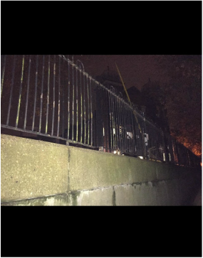
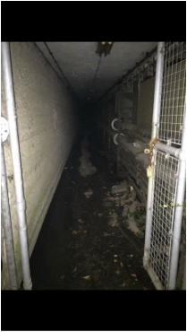
We all went to East Dulwich Hospital and went inside of the secret tunnel behind the hospital. There we filmed and took photos of it for our texture shots video.
Lexcye took videos and pictures while the videos for the texture video were being taken.
Lexcye took videos and pictures while the videos for the texture video were being taken.
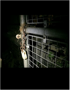
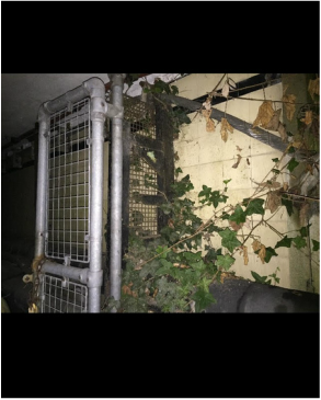
photos of the East Dulwich tunnel for the texture shots by lexcye
|
|
|
|
|
|
Here I took photos of the specific places and things we chose to include in our texture video. I tried to take them in the same and lighting that it would be displayed in the video to get a realistic view of how it would turn out in the video.
210
Filming at Police Station(Behind the scenes)- Tuesday 29th November 2016
|
|
editing of magazines by tanya

Here i placed the main image which i edited into the magazine make sure the text didnt really cover her face alot and make sure the image was the right size and didnt look stretched out.
|
|
|
changing production logo
We decided that the logo background did not look good on our poster and felt that it didnt look enough, so we decide to make the background black and also decided the brightness of the image so it does not take force away from anything on our poster. The last image shows the final version of our production logo.
sounds of trailer- BY TANYA
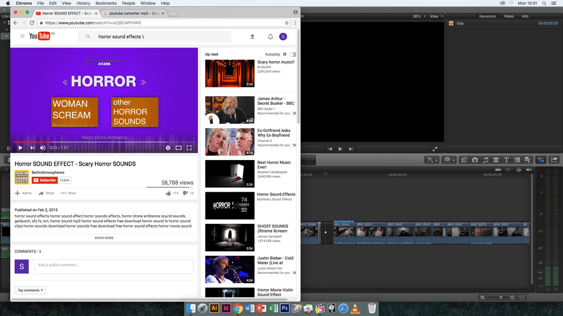
Here I looked for the sound, which would be placed into the trailer
|
|
editing of trailer- title slates- BY aMY
|

|

|
friday 7th december - feedback on all 3 productions
|
MAGAZINE
EBI - Incomplete - Needs more conventions WWW - Good colour on black background - Good photo |
POSTER
EBI - Tittle font and other fonts are not the same WWW - Good image - Eye catching - Text and background is effective |
TRAILER
EBI - Improve the continuity WWW - Recording of the soundtrack is good - Good use of titles slates - Different camera angles - Good jumpscares and quick cuts |
