In what ways does your media production use, develop or
challenge forms & conventions of real media products ?
The first evaluation question is about the conventions that we chose to follow, challenge and develop. By using the common conventions seen in psychological/supernatural horror films, we were able to produce real media texts that would appeal to the audience interested in this genre. Through looking at existing horror products, we decided we wanted to obtain the styles and features of the psychological/supernatural genres, most importantly following and developing the the conventions. For example, lots of psychological/supernatural posters use their antagonist as the main image of their poster. However, we also wanted to make our final products original, which was possible because we understood the conventions and could therefore challenge them.
Conventions by amy
Conventions are rules that can be followed or broken in order to make the product recognizable to the audience. For example, a horror movie can contain typical conventions such as a weapon or character type to indicate that it is a horror genre, appealing more to hardcore horror fans. However, these conventions can be broken in order to achieve a different purpose as overuse of them makes the movie predictable.
POSTER by amy
For our final movie poster, these conventions had to be researched from other horror movie posters and applied to our own. These existing horror posters also inspired us and is where we pull most of our ideas and conventions from. These inspirations, however, still allowed us to adapt and change these existing ideas to best suite our style creatively.
|
Mise-en-scene
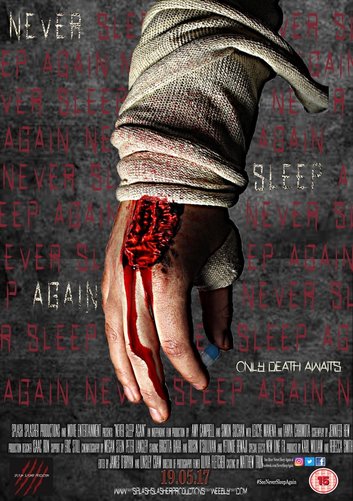
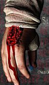
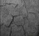
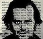
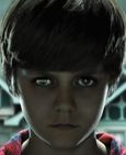
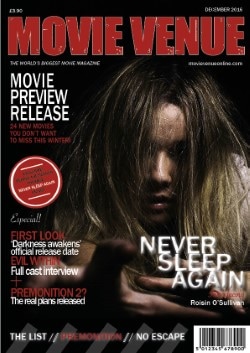
Lighting - The photo was taken under high key lighting as we wanted the image to be over exposed so that it will stand off of the page more. We later edited the image in Photoshop to highlight certain areas and also to create more shadows to give that spooky, low-lighting effect. Costume & Make up - The use of the bandage was a last minute decision. We thought that the sloppy, torn bandage would be effective and create texture in the poster. We later added the bandage texture over some of the text to make it more prominent and create a repetitive house style. Billing Block For the billing block on the poster we used a stereotypical font to match the conventions of other movie posters. We also adjusted the font size, length and distance in order to reach the typical layout convention. We also had to go back and change the release date in order to make it more prominent and noticeable. Company Logo We placed the company logo in the bottom left third of the poster in order to let people know who the film from. Although, this is not the most important information and so it can be hidden in the corner. However, the bright colours stand out and draw the eye in, not making it irrelevant. |
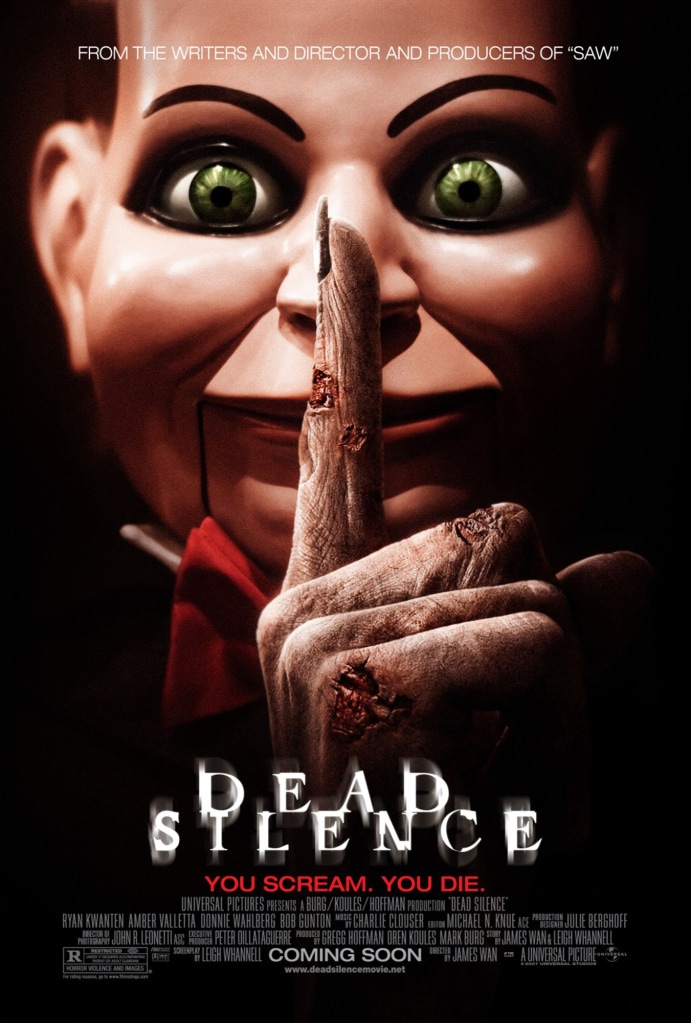
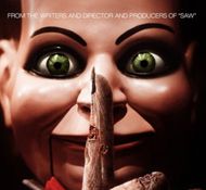
REAL MEDIA TEXTS - Some inspirations that we used for our poster include...
|
|
|
|
|
|
|
|
|
|
|
|
|
|
|
|
MAGAZINE by tanya
For both our magazine and posters we looked at other published posters and magazines, this was done so we could include the correct and right amount of conventions for horror magazines. We where inspired by other magazine which our ideas where similar to and this helped us to develop our ideas more and add it to the final ideas for our magazine.
Photoshoot Effects
We used different lightning for the shoots but some image included flash from the camera but no natural light was used in the studio where this shoot was taken. By only having her reaching out to the audience, we are able to draw the audience more, as this grabs their attention.
Cover Lines
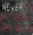
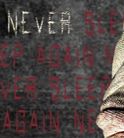
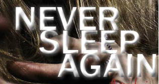
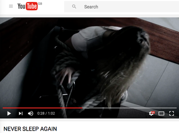
The primary cover line is critical and generally utilized as a part of genuine media writings. Commonly they are utilized to exhibit the fundamental component of the magazine. Our main cover line is "never sleep again" which tells the audience the exclusive magazine for this edition and by having different effects to all the other writing, makes it stand out the most.
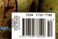
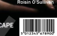
Barcode
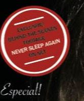
Barcode is important convention which has to be included as this is something every real media text uses. We did include the barcode so you would be able to scan in the magazine to know the cost of the magazine but we also included the price in the top left corner.
We used different lightning for the shoots but some image included flash from the camera but no natural light was used in the studio where this shoot was taken. By only having her reaching out to the audience, we are able to draw the audience more, as this grabs their attention.
Cover Lines
The primary cover line is critical and generally utilized as a part of genuine media writings. Commonly they are utilized to exhibit the fundamental component of the magazine. Our main cover line is "never sleep again" which tells the audience the exclusive magazine for this edition and by having different effects to all the other writing, makes it stand out the most.
Barcode
Barcode is important convention which has to be included as this is something every real media text uses. We did include the barcode so you would be able to scan in the magazine to know the cost of the magazine but we also included the price in the top left corner.
|
|
|
|
As have a cover line was a main convention of magazine in general we had to include one, we include more that one cover line, as this give the audience an insight on what to expect in our magazine, as it usually include exclusive products and giveaways for the audience which will make them want to buy the magazine to be able to find out these offers. This placed in the thrid section of the magazine as it need to stand out so the audience the movie which is included in this issues. Also, putting the giveaways in a red circles allows it to stand out as its the only thing which has a red circle which will be noticed first.
|
|
The barcode is incorporated into the magazine to imply that the magazine should be filtered with a specific end goal to be obtained. This permits the magazine to look proficient. The standardized identification additionally stores the cost of the magazine and a permits store to monitor what number of is being sold. The barcode is little as it’s important but not too important so is put in the bottom corner of the magazine.
The photoshoot effect by using photoshop to create darker contrasts and brightness . By cropping the black background out and also creating a dark low lightining which is a convention of horror magazine pictures. As this creates the correct mood for horror magazines. By decreasing saturation to loss the colour in the image as it was too bright and didnt fit the conventions when it was first taken. By doing all of these change allows the audience to know the genre in which this magazine is for and attract the right and correct audience.
MaGazine Evaluation
We used the correction conventions need for a magazine and kept with a strict colour scheme using complementary colours.
Overall we used the majority of the forms and conventions of existing real media magazines to help us create a magazine because this was our first time making a horror magazine. We needed to get influence and inspiration from somewhere which is why we used Horror Hound. As we are all creative individuals we didn't find it overly hard to adapt to the skills you need to make a magazine, being creative really help with producing the magazine. Following the conventions for a magazine helped use create a realistic horror magazine. I think the most successful part of the magazine is the image, its in the right third just like the real media text and this made a great different when it came to how professional the magazine looked. We stuck to the conventions because we know that horror fans would not be happy if created a brand new format.
Overall we used the majority of the forms and conventions of existing real media magazines to help us create a magazine because this was our first time making a horror magazine. We needed to get influence and inspiration from somewhere which is why we used Horror Hound. As we are all creative individuals we didn't find it overly hard to adapt to the skills you need to make a magazine, being creative really help with producing the magazine. Following the conventions for a magazine helped use create a realistic horror magazine. I think the most successful part of the magazine is the image, its in the right third just like the real media text and this made a great different when it came to how professional the magazine looked. We stuck to the conventions because we know that horror fans would not be happy if created a brand new format.
TRAILER by simon and lexcye
To assist us with assembling ideas for our trailer, we watched and analysed various trailers in order to familiarise ourselves with the common conventions of horror trailers. For example, what kind of pacing, editing and sound they used. Through the inspiration we gained from this, we decided to incorporate some of these conventions in our own trailer, for the film 'Never Sleep Again'.
Structure by Simon
An important part of the editing process, is following a certain structure in your work. Todorov believed that a story needs to have an equilibrium, disequilibrium and a resolution, in order to be interesting to the audience.

Equilibrium - The first part of the story, displaying a happy start where the majority of the characters are content and everything is as it should be.
|
Disequilibrium - The second part of the story, featuring a problem or something that would disrupt the happiness.
|
Resolution - The part of the story where the characters attempt to repair the damage and restore the Equilibrium.
|
This structure is perfect for film. However, when it comes to trailers, it has a weakness of being too revealing. The resolution should NEVER be shown in a trailer, as it gives away too much of the story. Teaser trailers also often do not contain a full Equilibrium as there isn't enough time to show these bits. Instead, we decided to start our trailer with some texture shots from the locations our story was set in. Like an Equilibrium, it introduces the setting but doesn't reveal too much to the audience. The main chunk of our trailer consisted of the most horrific bits, formed in a montage, leaving fans of horror wanting more. The template that we used for our trailer was The Conjuring 2 Teaser Trailer.
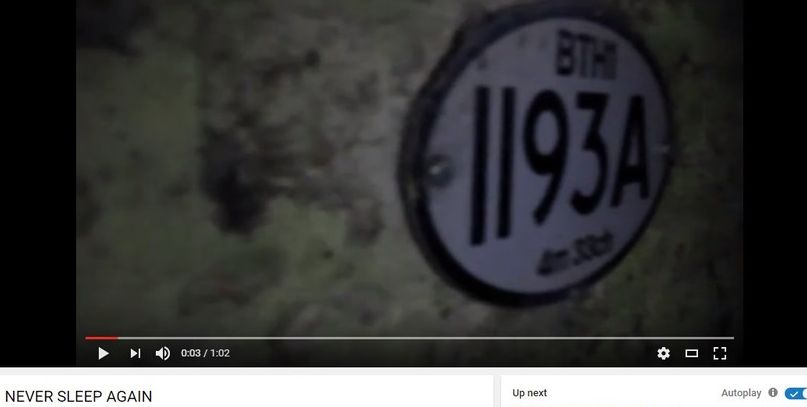
NEVER SLEEP AGAIN |
THE cONJURING 2 |
Length by Simon
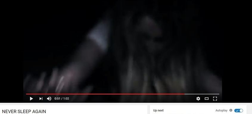
In our trailer for 'Never Sleep Again' we decided to keep the length of the trailer to the conventional time period. This tends to be around 1 minute. This is the perfect time period for a teaser trailer to not give away too much, but at the same time keep the audience interested and leave them wanting to see your film. Our trailer was 1:02, in which time we could show the main location texture shots, and build up a paced montage of stock scene shots. This included shots such as blood dripping down into a sink, or the girl being dragged into the darkness.
NEVER SLEEP AGAIN - 1:02

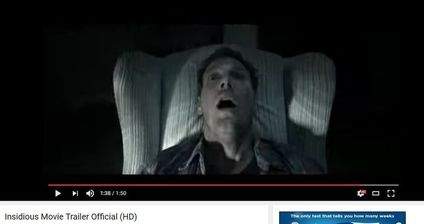
THE CONJURING 2 - 1:23

There is an unspoken rule for a teaser trailer to fit a certain length. This varies from under 1 minute to up to 1 minute and 30 seconds. Anything longer than this length isn't considered to be a teaser as it is simply way too long, therefore showing too much footage and revealing too much of the story to the audience. This would make the film less exciting for the audience to see and could potentially make less people want to pay money and go see the film.
Title Slates / Captions by Simon
Using the Conjuring 2 trailer as a template, we worked out the appropriate timing for different parts of our trailer. One of these aspects is the title slates. This is a convention that can be seen in many real media texts, especially in trailers. As a result of this, following this convention was a smart choice because it is a simple way of revealing information that the audience want to know about this film, without having to dialogue. It is an effective way of giving the trailer more suspension and making it more shocking, as it breaks up the footage in the trailer.
In the film world, there are lots of examples of Title Slates in real media trailers, giving the same effect to the audience that we are trying to achieve in our own production. It is a convention that can be used perfectly in order to create suspension and a form of build up in the trailer, as the audience simply doesn't know what to expect. The title slates normally contain names of associated production companies, or previous films created by the same company as the film being made. This means the people will be familiar of previous work made by these companies, and will therefore have a certain expectation of the film, judging if they would want to see it or not. We realized that The Conjuring 2 teaser trailer used this convention effectively, therefore we imitated the type of captions this trailer used, hopefully gaining a similar effect.
We also maintained a continuous font throughout the title slates. This gives the trailer a more professional look about it, making it more aesthetically pleasing. The texture of the background of the title slates is also continuous throughout the trailer for this same reason, making it look more professional and aesthetically pleasing. These backgrounds and fonts were also used in our poster for our 'Never Sleep Again' film. Keeping these the same among media texts is what be done by a real media text company, which is why we decided to replicate this.
Sound by Lexcye
Sound is an important element in films, but it is very vital in horror films. This is because the sound is what makes the film scary in horror films, without it, the audience is no longer frightened. Without the sounds in a horror movie the jump scare scenes would no longer be effective. Sound is broken down into three components which are music, speech, and sound effects. We used these components to create a specific unforgettable atmosphere for our audience and to set the tone. In our trailer we used the music to progressively build up the pace that led to the most dramatic scenes, in our horror teaser trailer. The different types of sound helped us intensify the visuals so that the viewer experienced fear and anxiety on a much deeper level, when viewing our trailer.
Diegetic sound
Diegetic sound is the sound within a movie that both the audience and the characters within it can hear. So for example the sound of a phone ringing would be a diegetic sound because it is heard by both the audience and the characters. The diegetic sounds make the film feel and seem more realistic to the audience, because its normally a common sound which the audience hear in their everyday life. The diegetic sounds in horror films are what create and give the audience visceral pleasure which they expect to receive from horror movies. This is due to the diegetic sounds being the sounds which are always used in the torture and killing scenes of the movie. Such as the stabbing sounds, the sounds of someones body being crunched by the antagonist with a weapon, and the sound of the antagonists weapon being swung and landing into something repeatedly.
Diegetic sound is the sound within a movie that both the audience and the characters within it can hear. So for example the sound of a phone ringing would be a diegetic sound because it is heard by both the audience and the characters. The diegetic sounds make the film feel and seem more realistic to the audience, because its normally a common sound which the audience hear in their everyday life. The diegetic sounds in horror films are what create and give the audience visceral pleasure which they expect to receive from horror movies. This is due to the diegetic sounds being the sounds which are always used in the torture and killing scenes of the movie. Such as the stabbing sounds, the sounds of someones body being crunched by the antagonist with a weapon, and the sound of the antagonists weapon being swung and landing into something repeatedly.
How we used Diegetic sound in our Horror trailer
We used diegetic sounds in three different scenes in our horror trailer. Below are the visual shots of what the scenes consisted of.
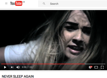
This is the final scene in our trailer before it cuts to black. In this scene the antagonist is being dragged on the floor into the darkness. The diegetic sound in this scene is the use of the antagonists high pitched scream. This was effective because it is a set pieces scene that is alsways found in horror movies. Therefore it followed the conventions of a horror film.
|
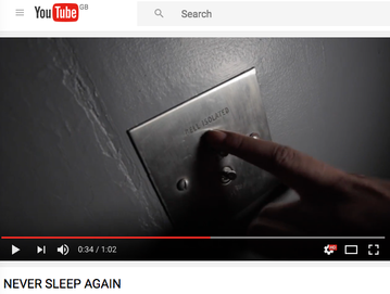
This scene is from the middle of our trailer its at the distruption stage where things start to take a wrong turn. In this scene a hand suddenly appears out of nowhere and enters the shot to turn down a switch therefore enabling the isolation in the room. When the switch is being pushed down there is a lous flick sound that follows after telling the and showing the audience that the switch has been enabled.
|
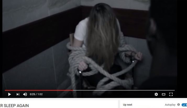
This scene shows the antagonist struggling to get out of the chair she has been tied to. It is placed right in the middle of the trailer in the distruption stage of it. While the girl is struggling in the chair you hear the chair and the ropes scrape and rub agaisnt the floor. This diegetic sound highlights how hard is struggling to be free from the chair and her captor.
|
Non-Diegetic sound
Non-Diegetic sounds are the sounds that are dubbed and edited over the films scenes to be in relation of sounds in a fictional world. They are the sounds which slowly build up the suspense and the tension right before and during the jump scare scenes. It is due to this specific sound that the audience get scared and jump in reaction to the sound instead of reacting because of what they are visually seeing. Non-diegetic sounds also have the potential of becoming iconic in horror films. An example of an iconic sound is Bemard Hermans theme from the movie 'Psycho' in the classic shower scene there is a high pitched string instrument notes with a very fast attack and rhythim that is are used to scare the audience to due to the suspense before the attack. Another example of an iconic diegetic horror sound is John Williams composition of the trombones and the tuba for the movie 'Jaws' most famous scene. the music captivated the audience while building eager suspence and curiosity at what would happen next in the film.
Non-Diegetic sounds are the sounds that are dubbed and edited over the films scenes to be in relation of sounds in a fictional world. They are the sounds which slowly build up the suspense and the tension right before and during the jump scare scenes. It is due to this specific sound that the audience get scared and jump in reaction to the sound instead of reacting because of what they are visually seeing. Non-diegetic sounds also have the potential of becoming iconic in horror films. An example of an iconic sound is Bemard Hermans theme from the movie 'Psycho' in the classic shower scene there is a high pitched string instrument notes with a very fast attack and rhythim that is are used to scare the audience to due to the suspense before the attack. Another example of an iconic diegetic horror sound is John Williams composition of the trombones and the tuba for the movie 'Jaws' most famous scene. the music captivated the audience while building eager suspence and curiosity at what would happen next in the film.
How we used Non-Diegetic sound in our Horror trailer
|
|
| ||||||
Above are three examples of the non-diegetic sound that we used in our trailer. We took inspiration from the type of music that we wanted to use in our trailer from movies such as the conjuring and insidious so must of the soundtracks have a similar type of rhythm and pace to those movies. in order to make the music sound more effective we even layered it in certain parts with up to three different sounds.
Pace by Lexcye
To set the pace in our movie trailer we used the three act structure to build and construct our teaser trailer. We decided to use this instead of just using one long scene from the movie, because we felt that by doing this wed be able to engage our target audience more by giving them a wider preview of how the film escalates as you watch the trailer. Another reason for us choosing to use the three act structure was because, we did not feel that we had a single scene that was strong enough to capture the audiences attention while giving them enough jump scares in one specific scene.
The Three act structure
The three at structure is a simple way of storytelling that dates back to even Shakespeare's era. It is not only used in movie trailers to present a story to an audience but it is also used in poetry, video games, novels, and plays. In simple words the three act structure contains three different acts to it, they are as follows; Setup, confrontation, and resolution. However this is how they are known universally, but in film specifically in movie trailers they are named as follows; equilibrium,disequilibrium/disruption and resolution.
How we used the three act structure in our teaser trailer
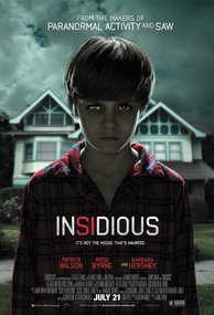
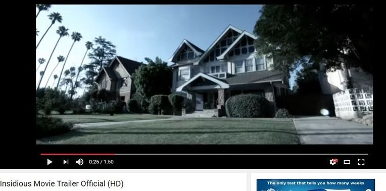
For us to be able to create the three act structure correctly we followed the conventions and the timing to suit the Insidious horror movie trailer.
Equlibrium
Equlibrium
|
|
For the beginning of the trailer all the way up to 25 seconds we used texture shots and a shot introducing one of the characters just like the insidious trailer did. In the equilibrium stage of the three act structure there is peace and nothing serious or dangerous has occurred. The duration of how long the equilibrium lasted for is not exactly the same as Insidious because our trailer is just a teaser trailer whereas Insidious is a full length trailer.
Disequilibrium/Disruption
|
|
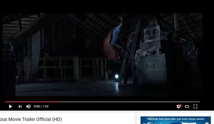
After the first 25 seconds is where the disruption begins to take place, in the scene you see one of the characters has been tied up and is being held hostage therefore showing the audience that peace no longer exists and something has happened. In the insidious trailer the disruption begins when the child falls of a ladder which is at the 30 seconds mark, five seconds after our trailers disruption.
Resolution
|
|
Due to not wanting to reveal the ending because it would just spoil the movie and discourage the audience from wanting to see it because of already knowing how everything turns out, there cannot be a resolution in any movie trailers no matter the genre it is. So instead therefor the resolution has to be removed out of the three act structure and replaced with a cliffhanger. In our trailer the scene we choose for our cliff hanger was one of the characters being dragged of into the darkness. In insidious there is a similar scene of the mans soul being dragged off into another place. However before the final scene both our trailer and insidious have a montage of scenes showing how everything goes haywire, leaving the audience wanting to watch it to find out how everything will be resolved.
