Horror Magazine &poster drafts
5 Poster influences
|
the Close up allows us not to see the face of the antagonist properly but only know its a female. the colour scheme is very dark using blue, white,orange which is the brightest colour which is not very bold. Using some green and pink which is darker aswell to bleach with the rest of the colours. the release date and headline are the same colour, which make them stand out the most. by using medium close up this doesnt not show us the antagonist face too much. |
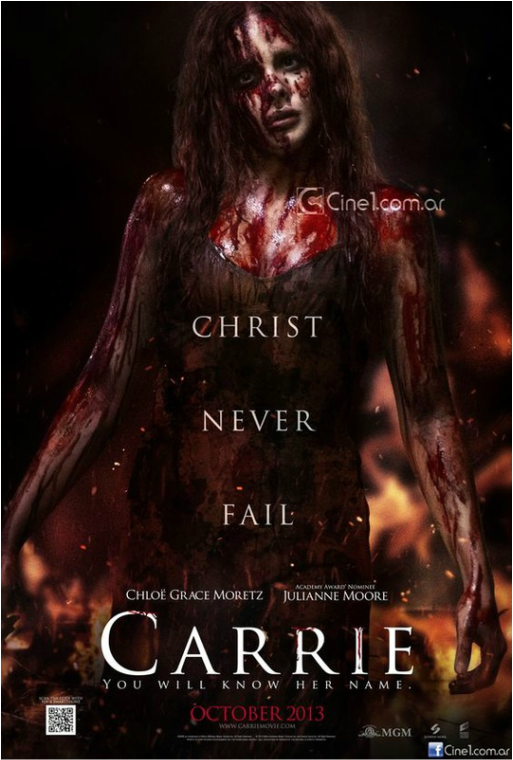
tHIS POSTER USEs the colour scheme of black, red, brown ,we like this as this red is dark just like the rest of the colour the red connates dead and danger which the film is all about. we liked the tag line as it goes well at the bottom but sound and look good either at the bottom or top. the date of the release is a different colour to the writing which makes it stand out and make you notice it. we can see the glance that carrie is making instead of hiding her face.
|
|
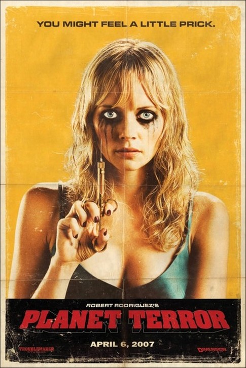
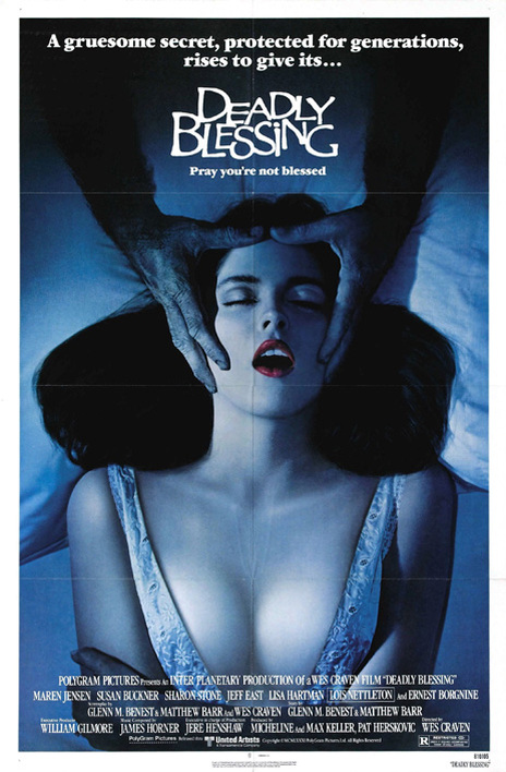
this poster is very sexualised as the woman is shown in a sexual position and she is presented in the male gaze by the man having his hands on her head its as if he is controlling her, show male dominated which is why we liked this image. the red lipstick connates danger and also seduction. this colour scheme is using a white and blue which mixed together create a sky effect which connate dreams and sleep. the tag line is brings the aspect of religion-"pray you're not blessed". as this poster shows different themes into one picture, make it one of the main influences for our poster.
|
this poster uses the colour scheme of yellow, red and black, this colour scheme goes well together as on the colour palettes. by using the protagonist on the poster this leaves the antagonist as mystery and not ruining the film. the tag line and release date and director credits are in a different colour than the title which make the title stand and also make the release date and tag line stand out as they are also different colour from each other.
|
|
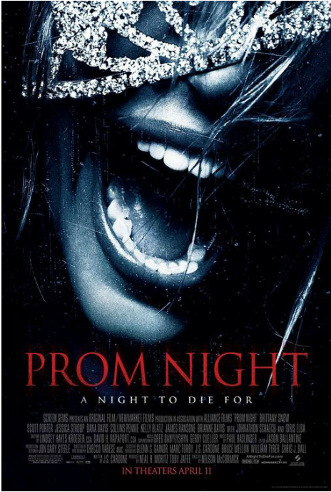
this use the colour scheme of red, white and black, this is similar colour scheme to most of the poster scheme, therefore we will not use too much red or black. this image is different to the rest as this a close up of the protagonist face and mouth which connates the scream queens as she is also a female but also has covered the face which make all the character a mystery. the tag line is using a line which is mostly positive saying but has flipped it and made it negative.
|
5 magazine influences
We like the colour scheme which is red, yellow,dark grey and red . The red dress connotes danger and seduction as the dress is ripped alot. Also the image was interesting as it drawn not photography which show the details to be very accuarate. The ripping of the clothes is a theme throughout the poster and make a scary effective of the poster. We also like the layout where there are cover lines on the right hand right underneath the title of the film and all the main text has a stroke using the colour scheme this make it more 3D and make it stand out more.
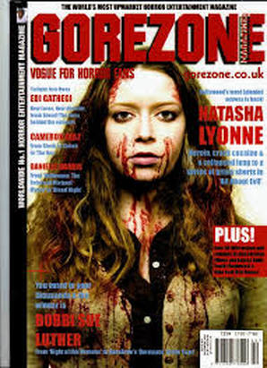
the mastehead is bold and clear. the colour scheme is white,red and white which contrasts with the image well, this is a medium close up and she is looking into the camera which make it eye catch as it seems as if she is looking at you. the red represent death and blood and doesnt not represent seduction as she is represented as the final girl as she is dressed more like a boy than girl by wearing oversized loose clothing which we liked.
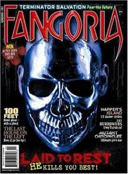
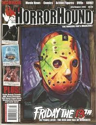
this magazine uses a border and has one main image but has three other images, we liked this as it was different and was presented well which didnt cause the cover to look over crowded. the mastehead is bold and clear and also have a stroke to make it more bold and than all the other writing. the colour scheme is dark blue, brown, black and red. for the title the 13th stands out as it has been fulled with red which represents the danger of that night.
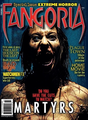
the main image is put in the centre of the page which show it to be the main focus. the text is bright as they use yellow, red which contrast with the darkness of the image and the blue background aswell helps. the film title stands out as it the only writing which is white. these colour used for this magazine go well together and compliment each other
this magazine uses the similar idea of the contrasts between the writing and the main image. as some of the text on the side are different size this uses the importance of the text using size which is a very techinque to use. also, the mastehead is the only text using a stroke to make it stand and out and look bold.