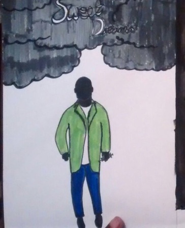
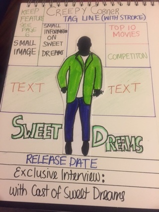
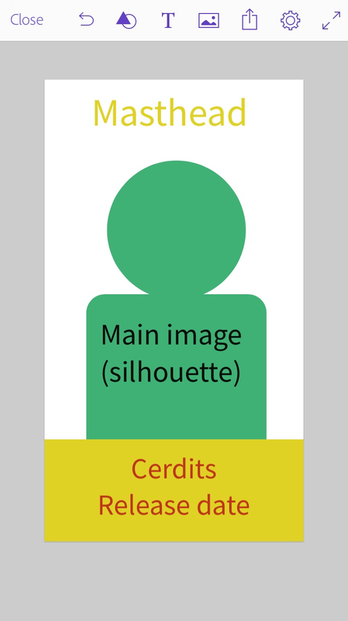
Here we decide to put the antagonist on front of the magazine but also decide to use his silhouette which leave him as a mystery. As this film based in your dreams and we put cloud which show dream like style. We decide that we wanted our theme to be green, black and not too much red stereotypical colour used colour scheme for horror.
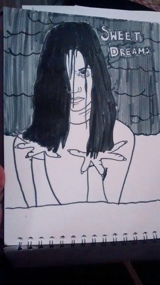
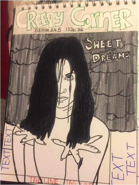
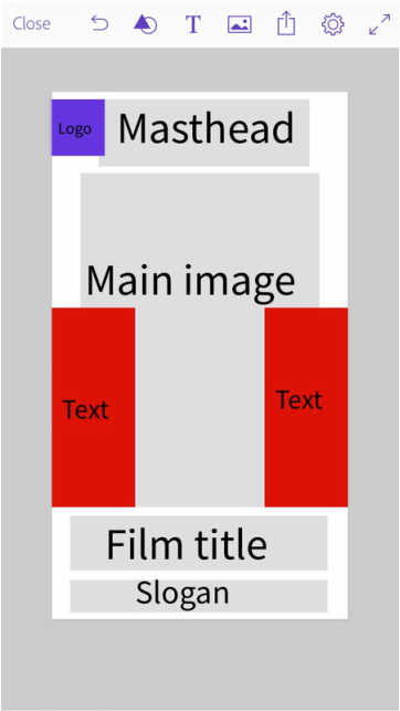
Here we used the protagonist again and kept the cloud idea for this poster, we showed the hair falling out by putting her hands in front with hair falling into them. We didn't really want to over done the masthead and decide to keep it simple and focus more on the main image. We didn't only to have one image and one model as she will not give too much away about the film.
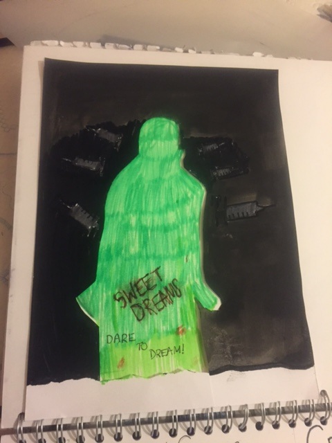
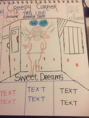
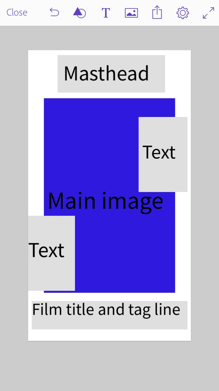
As we dont the magazine cover to be filled with information which is not important we decide to only have two areas with text and place the film title and tag line at the bottom as it would not make sense to put it on
|
AuthorWrite something about yourself. No need to be fancy, just an overview. ArchivesCategories |
 RSS Feed
