how effective is the combination of the main product and ancillary text?
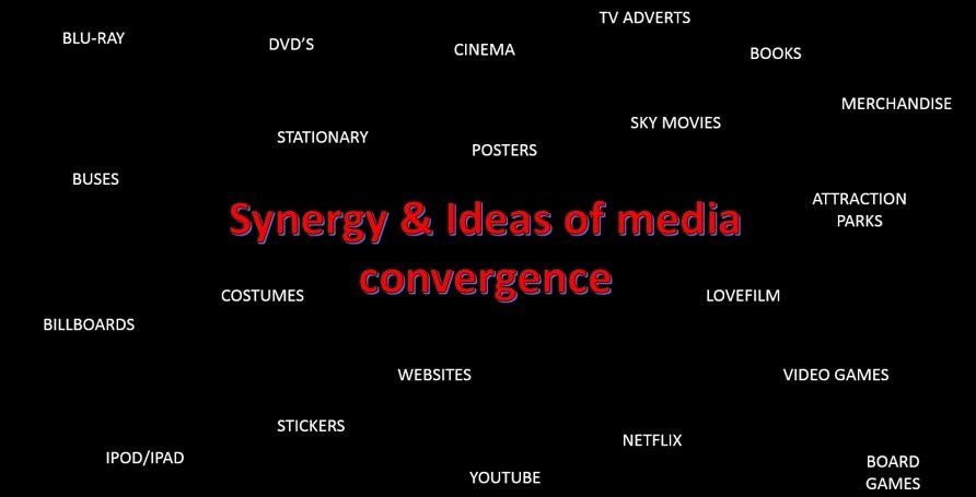
Below are our answers to evaluation question 2. Within each category you will be presented with explanations and examples on how we worked towards making our product effective with the use of the main product being our trailer, and our ancillary texts which include our film poster and our magazine front cover. To make our product effective we used combinations of different media platforms to enable there to be synergy and cross media convergence occurring in our product.
Convergence is now very effective due to it being key for the film industry in terms of companies making sure their film is a success and is able to not only gain revenue, but also make a profit to be successful within the box office. Film companies work on making their film a success by creating a franchise out of it and then using cross media convergence to establish a strong recognizable brand image and to make as much profit out of the films name out of it.
We will discuss the brand identity of our film Never Sleep Again and look at how it compares to other real media texts. We will also discuss whether or not we have a strong enough brand, to be able to develop sequels and turn our film into a profitable franchise.
By Lexcye
Examples
|
|
By Lexcye
Examples of synergy and ideas of media convergence
Below I have listed a number of examples in which movies companies can advertise and promote their film.
For a film franchise to succeed and be bale to not only make revenue but to also gain a substantial amount of profit from it the films have to be advertised through a number of different media platforms. The film makers will often work with their businesses subsidiaries to create more forms of advertising and selling the product.
|
By Lexcye
|
success of other real media texts BY SIMON
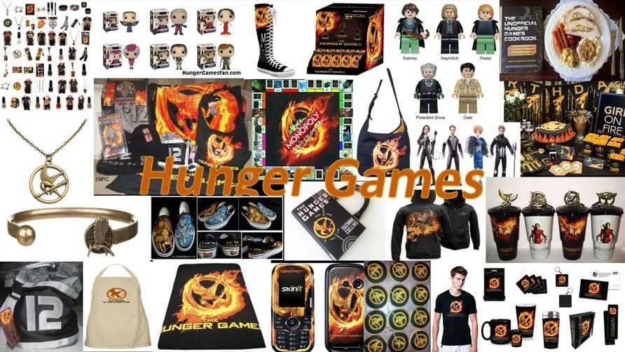
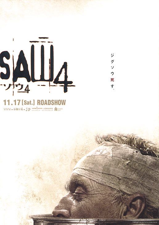
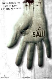
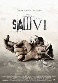
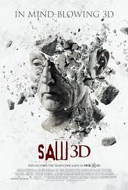
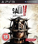
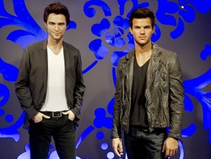
One brilliant example of a horror franchise that uses CMC and Synergy incredibly well is Saw, despite being of a different sub-genre as our film. Saw is a horror franchise that was distributed by Lions Gate Entertainment and has been produced by Twisted Pictures. This franchise consists of 7 feature films as well as merchandise. James Wan and Leigh Whannell's 7 film franchise grossed over $873 million worldwide at the box office, selling over 30 million DVD's. The success of Saw's cross media convergence earned the franchise a Guinness world record title in 2010, 'The most successful horror movie series'..
|
|
|
|
|
|
|
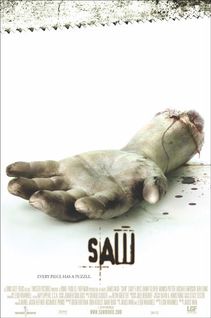
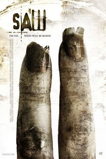
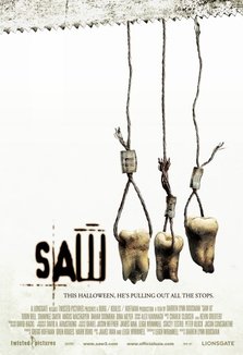
All 7 Saw film posters
|
Saw II
|
Saw II Trailer
|
Saw III Trailer
|
|
Saw VI Trailer
|
Saw V Trailer
|
Saw VI Trailer
|
Saw VII / SAW 3D Trailer
From theme park rides to video games, the Saw franchise was very successful when it cam,e to cross media convergence. By 2013, Saw was everywhere, with their continuity throughout their products making them easy to brand and very marketable. Whether it is on their film or game posters, or general merchandise such as mugs or stationary; the typography and colour scheme is continuous throughout, which is a very important factor in the franchises overall success. The use of the white background with the grudgy texture all the way through from the original Saw film, to the final Saw 3D film, shows the amazing marketing ability of this franchise. People are familiar with this theme throughout and will always recognize the Saw franchise by these conventions, making this a huge success.
|
BILLBOARD
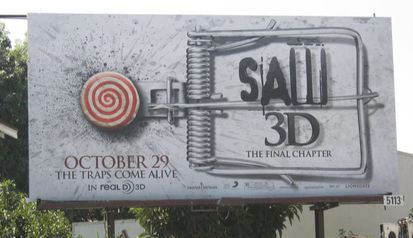
Lions Gate Entertainment is one of the biggest major film distribution companies. Therefore, have a massive budget to spend on advertising, and can afford to put up large scale billboards such as this all over the world to promote their films, in this case Saw 3D The Final Chapter. The franchises film posters had a continuity of this white background and grudgy effect; which is also seen on this billboard. This continuity in the marketing campaign for this film attracted peoples attention and helped sell a staggering $135 million at the box office from just a $17 million budget.
|
BLU-RAY
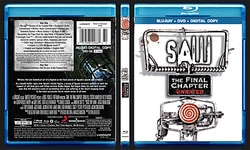
One example of the continuity present throughout the different media platforms is Blu-Ray. On the cover for the Blu-Ray copy of the final chapter of Saw, there is a very similar concept to what was on the billboard. A similar design of a mouse trap appears on the cover of this Blu-Ray disk, with the same typography on the 'Saw' title, with the 3D element missing to it and the colour being changed to white with a black outline. The Saw Final Chapter 3D film charted number three in its first week of realease accourding to the Nielsen VideoScan chart.
|
|
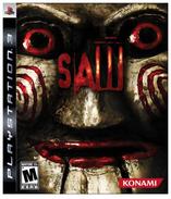
PlayStation
There aren't a lot of video games that are created based on exciting Hollywood horror films, which proves just how marketable Saw really is. It wasn't just able to release one game, but managed to release a sequel to it too, which shows how well the marketing really is. The cover of the first game consists of the Jigsaw's (the doll) face, along with the recognizable typography of the film title. The colours are similar to those that are seen on other real media texts such as billboards and posters. Saw II: Flesh & Blood was released October 19th 2010, 10 days before the release of the final Saw film.
|
Saw: The Ride at Thorpe Park
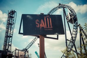
The final and most exciting form of CMC of the Saw franchise is their theme park attractions at Thorpe Park theme park in London. Not only have they got Saw: The ride but also Saw: Alive which is a live-action horror maze which was built specifically to compliment the roller coaster ride. There are sever Saw iconography elements around the ride and maze to keep the constant theme; such as barbed wire, chainsaws, amputated limbs and of course, Jigsaw himself. The same typography and colour scheme features throughout the Saw section of the park.
|
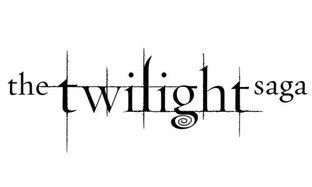
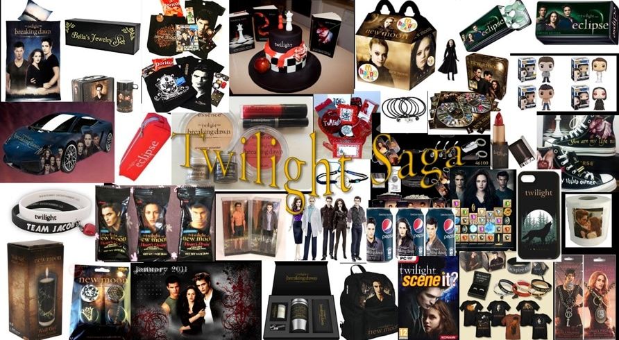
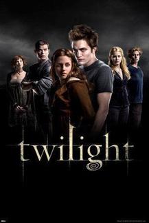
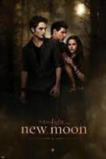
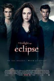
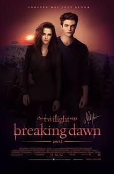
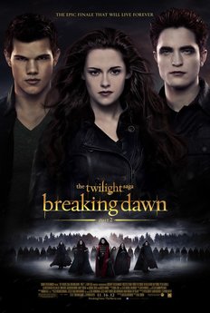
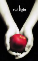
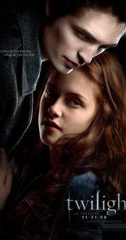
Another amazing horror type franchise which has used synergy and Cross-media convergence is is the 'Twilight' franchise. Although not completely being a horror film, but more using horror characters in an Fantasy film, it has still been successful with the use of CMC and synergy. Twilight is a franchise that was produced and distributed by Summit Entertainment. This franchise is based on 4 novels, but made into 5 films; splitting the final book into two films. There was also a very high market for merchandise from this franchise. Chris Weitz and Bill Condon's Twilight franchise grossed a total of a staggering $1,363,537,109 at the box office.
|
|
|
|
|
The 5 Twilight Saga Posters
|
Twilight
Eclipse
|
New Moon
Breaking Dawn: Part 1
|
Breaking Dawn: Part 2
|
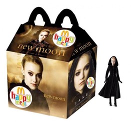
McDonald's is one of the largest fast food chains in the world. It is globally known ad is popular around the whole world. Since twilight is a horror character based fantasy film which is aimed for a younger audience, it makes perfect sense to advertise it with a meal menu designed for this audience. The packaging for the meal acts as a form of advertising for the film, and you also receive a toy of one of the characters from the film. This form of Synergy allows the film to be promoted through purchasing food at a worldwide known restaurant. |
|
Madame Tussauds is a famous museum, which creates real life size waxworks of Celebrity's, movie characters and inspirational people. At the London Madame Tussauds museum, there is a twilight section which has real life sized waxworks of Edward the vampire and Jacob the werewolf. This allows people an opportunity to, in some sense, meet the characters and experience the film in a whole new experience. |
|
|
Another example of synergy being used in the Twilight franchise is the original novels changing their covers in order to reflect the film posters. This was also tied into the release date of the film, so the novels sold in the lead up to the release of the film had the covers that you would have seen on posters, promoting the film. |
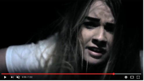
trailer and poster by amy
|
|
|
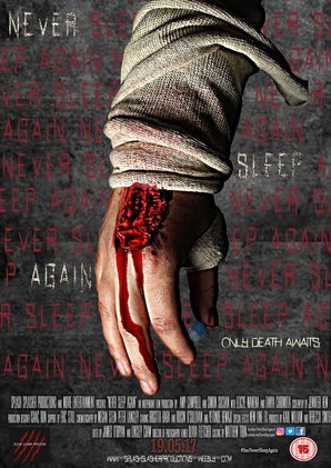
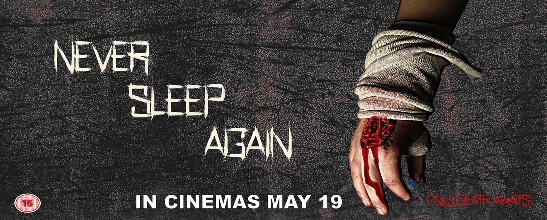
Font: The font on the poster is the same as the title slates in trailer. This gives the sinister franchise continuity as the brand is specific and the same throughout. This also creates a recognisable brand that people can identify with.
Colour schemes: The background on the title slates is identical to the poster. The beginning of the trailer does not match the poster, however, when the storyline starts to go wrong in the trailer, the colour does turn grey and dark with cracked videos to reflect the theme of the poster.
|
Characters: As there is only one character on the poster, it is difficult to tell if she appears in the movie as she is faceless and her identity is unknown. However, in the montage towards the end of the trailer, similar outfits are seen to show that it sticks to the theme.
|
|
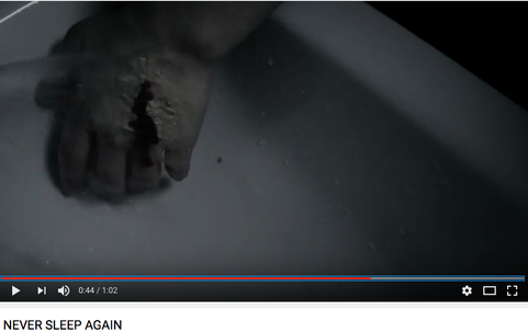
Now Ours: Similarly, we feature the same conventions in our trailer as we did in the poster ancillary task. The hand, which is the main section of our poster and marketing, is seen in the trailer however, not too much as we do not want to give away the story.
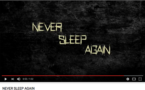
Our font is the same throughout the trailer, in the title slates and the end slate. It matches the font on the poster and even laid out in the same staggered style.
Our font is the same throughout the trailer, in the title slates and the end slate. It matches the font on the poster and even laid out in the same staggered style.
|
|
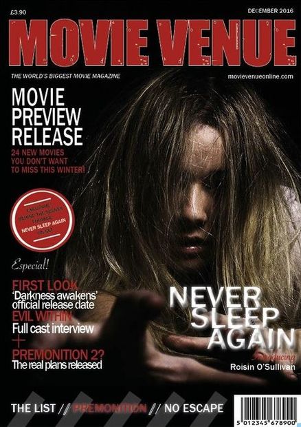
trailer and magazine by amy
|
|
|
Font: The big red 13 at the end of the trailer is identical to the font used on the front of the magazine to indicate what the movie is. However, after some research, we came to the conclusion that this is rare in magazines and they often do not match the font of the movie.
Colour schemes: There is a consistent theme of red throughout. This matches the magazines font and their stereotypical colour scheme for this magazine.
Characters: The protagonist features in the trailer and on the poster making him recognisable and relatable to the movie. His mask has to be one of the most recognisable masks in the history of horror and so it is an important factor to show when advertising the movie.
Now Ours: The font type does not exactly match that of which is in the trailer, however, this is typical of most movie franchises. The organisation of the text does match that of the trailer and the poster which keeps the continuity of our brand alive. Our colour schemes match between the two products, using red and black paired with an off white to represent decay. We also use the same character on the front of our magazine that we use in the trailer to make her recognisable to the audience so that people relate her to our movie. She is also in the same position as she is in our final scene in the trailer to keep the theme reoccurring.
|

|
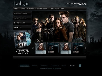
trailer and website By Tanya
|
|
|
FONT: The fonts used for the captions in the trailer as on the website is not caption but still keeps the same style to the words using a glitter effect on both website and trailer but different colour.
COLOUR SCHEME: The colour scheme shown all throughout the trailer uses contrast of dim tones and textural shoots is different to the website as they just use the different tone and dim tone for the website as it represent the darkness of the film and the danger.
CHARACTERS: The entire franchise centres around Bella and Edward and this family which they are all present in the trailer and on the website. Similar to the trailer, Bella and Edward both wear same colour in one of the scenes and this is shown on the websites.
As all the character are include in the trailer, they are also including on the main image on the homepage of the website but as Bella and Edward are the main character they are placed in front and seem to look larger than the rest of the characters.
|
|
|
FONT:The fonts for the captions for the trailer and the websites are the same colour but different styles as they where both created on different applications(Final Cut Pro and Wix).
COLOUR SCHEME: The colour are the same as both and the magazine and poster are used on the website and these follow the same colour scheme as the trailer, both feature the hand which is on the poster.
CHARACTERS: The main character is shown on the magazine and also in the trailer, she shown to be wearing the same colour as in the trailer throughout. She also is posed the same as the last scene of our trailer as she is being taken into the dark.
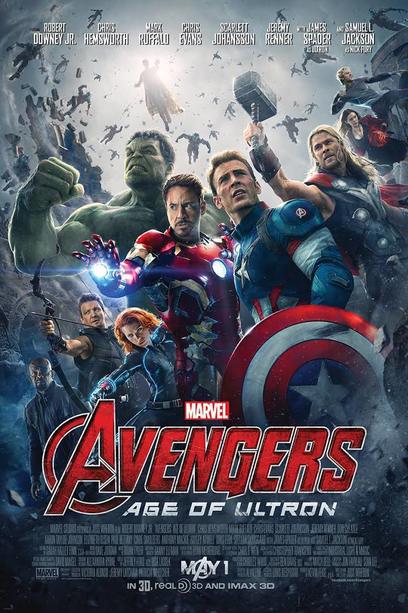
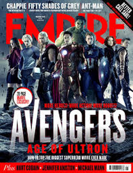
poster and magazine
An Example
|
|
Font: The font used on the magazine is the font that was used on the poster was the same that was used as the films official font title, however the font used for the title of the film on the magazine was a slightly different version but still was very similar to the original one. Which helps there maintain a constant look.
Colour Scheme: The colour scheme between both of these ancillaries are very similar and therefore have the same look and effect. The background colour of the photos on both the poster and the magazine is a grey and bot ancillaries use red and a very similar font for the titles and headings. The colour scheme clearly in both ancillaries clearly grey, red and white.
Characters: In both ancillaries they have chosen to showcase all the characters in the Avengers team instead of choosing one character and just focusing on them. This makes the main image more powerful and bold for the viewers, due to the vast different looks and stances the characters are posing in.
Now Ours

|
|
Font: For the font of the title of the movie, we did not use the same one because the font on the poster would not have looked appealing and as bold as we wanted it to look if it had been used on the magazine. Thats we changed the font completely and went for a bold faded effect white that stacked the three words of the title together leaning to the right in a staircase ladder.
Colour Scheme: The colour scheme we used in the poster was kept exactly the same to the one that we used on the front cover of the magazine. We did this to show cast the consistency of the colours and also because the colours are bright and eye catching which would draw in the viewers attention.
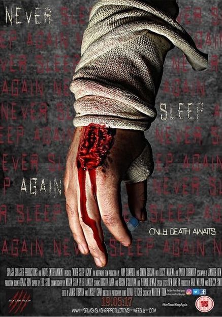
Characters: The characters on both the poster and ancillaries are the same however there's a obvious difference between how the character has been shot. On the Poster there was only a close up shot of the characters injured bleeding hand holding a pill. We decided to do this because we thought it made more of a statement and was diverse, in comparison to the classic close up shots of the main characters face. This hid the characters identity making the viewers have to go watch the film in order to find out whose hand it is. In comparison to the photo of the front cover of the magazine where a gender is actually visible. The shot of the character was a close up however their face remained concealed with the shadows, lighting and the use of their hair. We feound that this made the photo more striking due to the pose of which the character was in.
By Lexcye
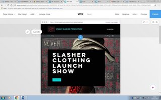
poster and website

|
|
FONT: The font of the title of the magazine are both the same as they use the same font but different colours for the poster and website.The website uses all rounded images from the film but the poster is including on the homepage. As Twilight which has 5 films as one is put into two parts.
COLOUR SCHEME: The font, colour scheme and characters are the same but the main image include the whole cast including the poster having an higher contrast level. Twilight has many different promotional posters as it has series of films and it is the success of their use of synergy that helped them at an estimate gross of $142.8 million box office.
CHARACTERS: The two main character are including on the poster but other poster include the whole cast or three of the main character. The homepage of the website including the whole cast as every film touched on different areas of the main characters life.
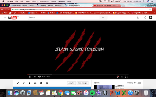
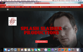
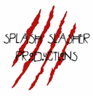
logo By simon
|

|
The logo for our production company, Splash Slasher Productions, features on our film poster, website and and on our trailer. Our website and poster feature the original logo, however, our trailer features an interpretation of the logo which fits the house style of the trailer. Our original logo consists of the colours red, black and white. These same colours flow throughout our whole portfolio for Splash Slasher productions, maintaining a constant theme. Our alternative logo for the trailer consists of the same colours; however, the black and white have swapped roles. Instead of the background being white it is black, and instead of the font being black, it is white. It is very important that we display our production company logo on our real media texts in order to maintain brand identity.
brand identity BY TANYA
The most successful film brand or franchise could have the difference from a grossing of $900millions in the box office or their grossing is under $300million so you have to make sure you get everything right. Branding is the most important when it comes to marketing as this give the company an identity and something that people can recognise them from. The three key features of branding are the colour used, typography and the name of the film, these must constantly be used therefore the marketing of the franchise. The strongest branded film which is easily recognisable by the public such as McDonald’s with yellow “M”.
We decided to keep the text type and colour the same throughout our products, as we went to create a strong brand as the name is something you will remember, as the writing was white with a stroke it was easy to use it everywhere as white is a colour that goes with every colour. We took inspire from ‘Before I Wake’ uses one main image and the title is placed in the bottom section of the thirds.
Brand identity is similarly as essential for production companies as it is for the movies they create, particularly the major film studios. Companies wish to have a solid logo keeping in mind the end goal to help and advance moment open acknowledgment of their organization. Logos are either simply realistic or are made out of the name of the association. The best logos are those that can trade to suit the topic of the blurb or wherever it might be put. There are a few logos that are initially in 3D. It is essential to have a logo that can adjust in circumstances, for example, that with the goal that you can in any case expand on the brand identity of the logo while keeping up the subject of the auxiliary content.

|
|
We felt that logo looked fine 2D so we didn’t not have different versions of our logo has we felt this could confuse the public when trying to recognise our logo, we kept a similar colour scheme to our poster and magazine so they could all link. Only thing we changed was the background to black as it had a better contrast than the white.
Splash Slasher Production is a British company which headquarter are in Christ The King Production in Sidcup. Splash Slasher Productions have many subsidiary companies such as Splash Slasher, S.P clothing, Splash Music, Slasher Animation. It also operates a comic book and owns 75% ownership interest in the comic book, as the 25% interested is owned by Comic Book Production.
SYNERGY THROUGH OTHER MEDIA PLATFORMS
ADVERTISEMENT
Bus stop ad by Lexcye
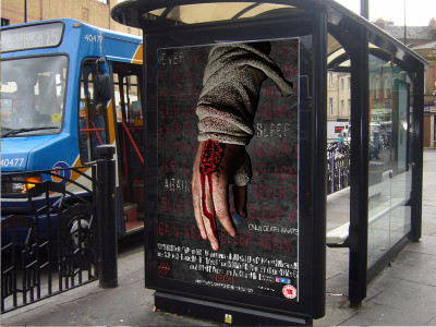
Bus stop advertising poster
|
Actual photo of poster
|
Above is a picture of our film, Never Sleep Again, being advertised at a bus stop in London. The picture features a poster design which is exactly the same as the final film poster since none of the conventions have been removed or replaced with new ones. The reason for keeping it the same is to create sense of continuity and for it to become memorable to the audience. Keeping it exactly the same as the film poster will allow the audience to be able to identify the movie correctly anywhere they may go and see it.
Piccadilly Circus banner by Lexcye
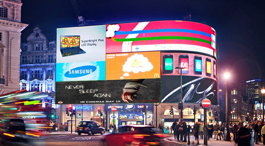
|
Actual photo of the film banner
|
Piccadilly Circus advertising banner
Above is a picture of our film being advertised on the Piccadilly Lights in the epicentre of London at Piccadilly Circus. As one of the busiest attractions in London, the Piccadilly Lights attract a 24/7 audience of over 2 million visitors each week from all different countries since its a very famous street for tourists, this makes it one of the best places to advertise. The poster design is similar to the final film poster due to using the same photo, what makes it different is that it has been made horizontal this time and only includes the name of the film with the tagline and release date. The poster banner still has a sense of continuity as the typography for the film title has remained the same as to has the colour scheme; red white and black.
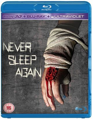
BLU-RAY BY SIMON
|
Blu-Ray disks are designed for the storage of high definition and ultra high definition video and data. This ranges from 720p to 2160p quality which is extremely high. We have chosen to release copies of the film in Blu-Ray because, although it is a little more expensive than a standard DVD price, it guarantee's you the highest quality possible in your viewing experience. Between 2006 and 2010 the rise in Blu-Ray disk sales in America alone rose from 1.2 million to 350 million, proving that it is a popular format for film viewing. Our cover for the Blu-Ray packaging consisted of the same colour scheme seen throughout our media texts such as the poster and trailer. The image of the hand is still seen, as before in our posters, trailers etc. The font is also the same as in all other media texts, and the grudgy texture is used as seen in lots of other media texts which are related to this film, maintaining continuity across various media texts. |
|
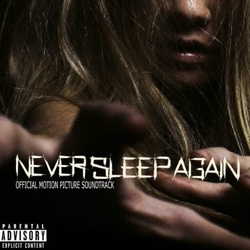
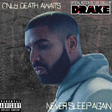
Soundtrack by simon
|
|
Above are the two pictures of music artwork, based around our film 'Never Sleep Again'. It is commonly seen that that feature films release soundtracks with scores, compositions or songs heard throughout the film. There are also often singles released for certain films which are by a famous artist. This is in order to gain an extra audience targeting tool. People who are fans of certain artists who are featuring in the official film single may be tempted to go and see the film for themselves. A few examples of films that have had successful singles recorded for them are Fifty Shades of Grey, The Bodyguard and Trolls. The left hand side art work is designed for the official Never Sleep Again soundtrack, which contains the general familiar design and continuity. The right hand side artwork is the cover for the official single which is also heard on the soundtrack. This single is titled 'Only death awaits', which is the slogan for the film. This was written and recorded by the globally known artist 'Drake', as many of our target audience for the film would be fans of his music. So therefore this will bring an increase on the interest in this film. The colours on the cover; black, white and red are the same that you have seen throughout other products like the poster and trailer. The typography is the same as these other products too, as well as the grudgy texture background.
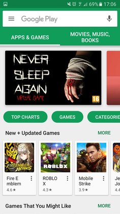
Google play store game app BY simon
|
This is a screenshot taken from the Google Play Apps and Games homepage. The play store is a digital application and media store for Android. It contains various downloadable media content such as apps, games , books, music etc. To this date, there has been a record of 95 billion downloads from the Google Play store. Prior to the release of our film, we have decided to create a virtual game that will be interactive for the audience. You will be able to experience horror through your screen and the use of your camera. This game would be available to download for FREE. This is because, the aim of this game release is to promote and advertise the film, rather than gain a big revenue from it. The game design still includes the same continuity, colour scheme and typography throughout. This is necessary to keep everything aesthetically pleasing. |
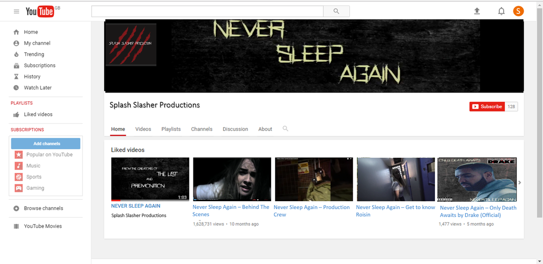
youtube account by amy
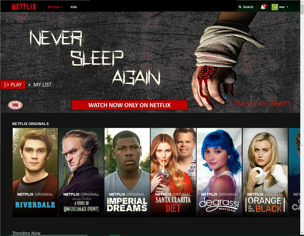
netflix feature by amy
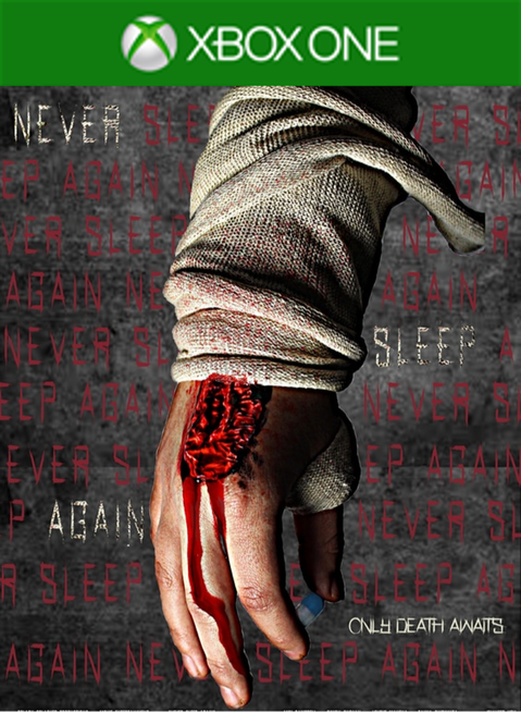
xbox game by amy
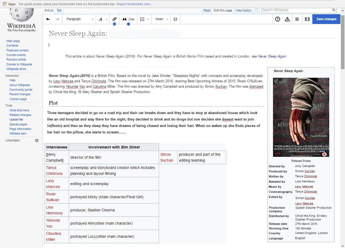
Wikipedia Page by Tanya